Saturday, February 20, 2016

Still Life

The Still Life in art has always been an interesting genre. For an artist, it's a great way to explore formal qualities, but even more than this, it can be about something that transcends the depiction of objects. One only has to look at Cezanne, Morandi, Uglow or the Dutch 17th Century painters to realise there is more to the art of still life than the observation of the material world. 

The reason I chose an older style telephone is because a receiver left off the hook creates an ambiguity that a digital phone cannot suggest. In my painting it's unknown whether a person is on the line or not which is a different mystery than the words missed call on a digital phone. With a digital phone the text would need to be shown but an older phone provides an image that's purely visual

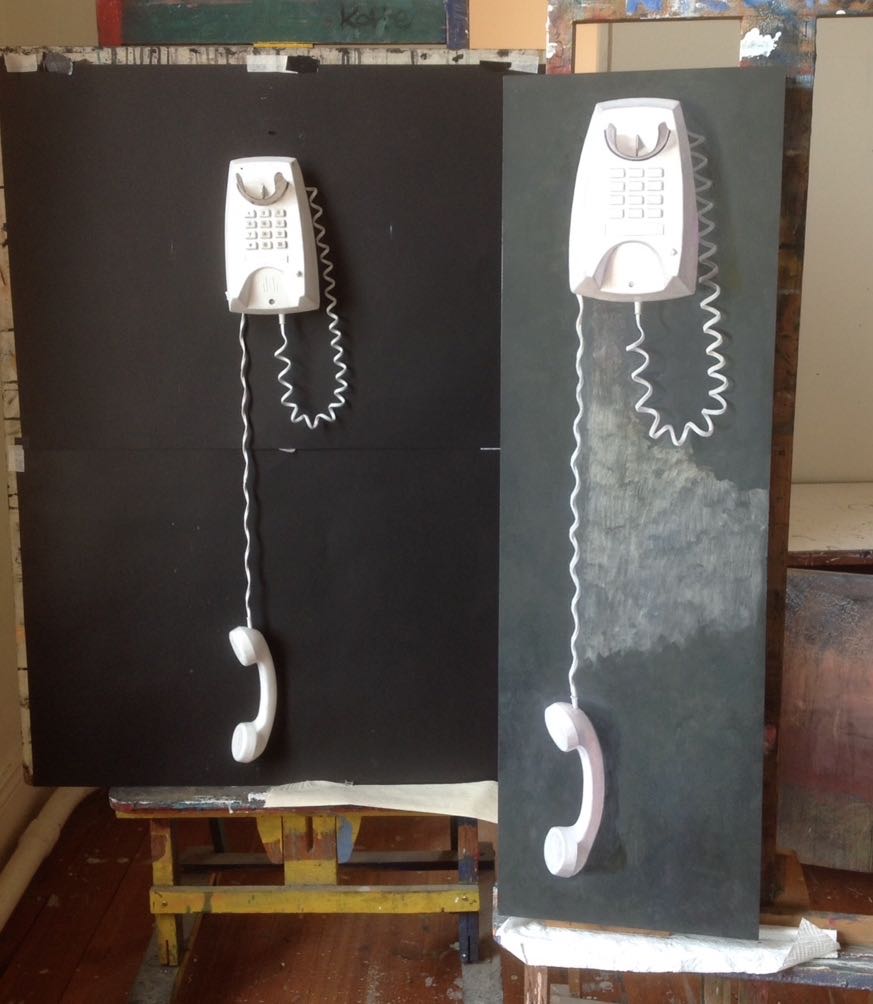
I thought I would include a few progress shots and how I set up the still life. I wanted a white phone but I could only find one in a cream, so I painted it over with white oil primer. I always imagined the receiver off the hook and hanging down, but when I set it up I instantly realised the cord would be too long for the composition to work. The only way around this problem was to make a loop and I think it created an interesting pattern and a better composition than what I initially imagined. I also liked the way the cord stretched under the weight of the receiver which contrasted with the curls in the looped section. 

As I have said in other posts, the colour white has always been significant to me as it evokes the possible transcendence of the physical. In this way, my still life paintings aim to combine earthly forms with a metaphysical colour.


 Listen2015, oil on MDF, 107.75 x 33.5 cm


Friday, February 12, 2016

The Illuminated Manuscript


I've always been fascinated by illuminated manuscripts; they are like Gothic cathedrals in the pages of a book. In my paintings, light is an important quality I try to capture, but pattern is the graphic equivalent of light. It can inspire the mind through the eye. 

Many years ago, in the late 1980s, I did a short calligraphy course, and it inspired me to create my own version of the illuminated manuscript. 

The designs were worked out in sketch form first and then drawn onto the paper with pencil. The border designs were done with watercolour and gouache paints, and the text with black ink. The gold is water-based paint, an alternative to the burnished gold leaf used in medieval books. The rose in the top work was painted from life, and I've introduced its image into other calligraphic works. Although the rose has many symbolic meanings, I portrayed it simply because of the feeling one gets from just looking at it. The top one measures 58 x 41.75 cm and the other 54.5 x 42 cm.
I've always loved philosophical sayings, and have written some of my own. I keep my sayings brief to evoke an idea to contemplate.  


Monday, February 8, 2016

The Self Portrait

I've always been interested in artists' self portraits. Vanity is never an issue when an artist scrutinises their face because the work of creating a person is too intense and demands all of the artist's attention. It can also be an opportunity to teach oneself about the intricacies of portraying a human being without any distractions or time limits.

The painting, City Light and Reflections, was a picture I've wanted to do for along time. The idea came to me in a painting class when one of the students was at a loss for a subject to paint. I happened to look at the window, and saw our reflections against the lights of Brunswick Street, so I suggested she try and paint her own reflection. But I also thought about the idea when I got home from class and made up my mind to do my own version one day. One of the difficulties in painting a picture like this is to have the right room looking over the city, and two years later, when I was doing my residency at Federation University Australia at Ballarat, the opportunity to paint my reflection against the street lights presented itself. The background is the corner of Lydiard and Sturt Streets, and the large golden streetlight was a feature I thought was magical.

It was a tricky subject to interpret. The miriad reflections created a pattern of confusion, so simplification was necessary. As the painting unfolded, I made decisions of what to put in and leave out, though this is the case in whatever I paint. Sometimes I've added a subtle light where it did not appear, and placed things differently to where they occurred in actuality. Composition always has precedence over geography, although the character of a place must be retained by not distorting the facts too much.

I think night lighting offers an artist an interesting subject to explore, and I feel this will be a greater influence on my work in the future.


City Lights and Reflections, 2015, oil on canvas, 81.5 x 61 cm


Self Portrait in Blue Sweater, 2015, oil on linen, 46 x 36 cm